
Continuing with Qumulo network-attached storage, our research identified that real-time data insights weren’t readily available via our competitor’s products.
It was very time consuming for storage admins and a struggle to tease out insights from stale data. Without immediate and proper insights, they often relied on external consultants employed by their storage solution providers for support. It was very expensive to get the data they needed for planning and troubleshooting purposes. Storage admins felt stuck and powerless to improve the quality of service they provided to their end users or to reduce the cost of customer support.
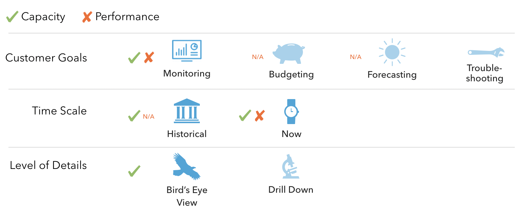
We identified four primary use cases related to data insights: monitoring, budgeting, forecasting, and troubleshooting. Each use case required a different timescale that was adjustable based on the user’s purpose.
My roles: UX strategist, hands-on designer, researcher, UX writer
Accomplishments
- US 10318494: Analyzing and visualizing trends in the use and consumption of data in a shared storage system
- US 1009507: Filesystem capacity and performance metrics and visualizations
- US 20160371297: Filesystem capacity and performance metrics and visualizationsUS
Before Qumulo Solutions
Customers had four goals shared across data types. They needed an efficient way to see capacity and performance insights. The color symbols next to each item indicate the availability of insights prior to Qumulo.
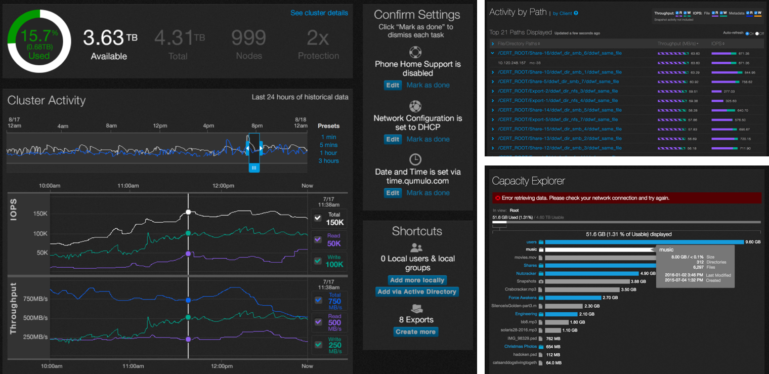
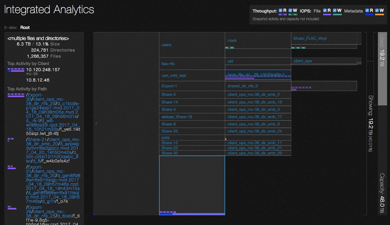
Combined Data Views
Users had to flip between capacity and performance separately to get a full story of what was happening with their cluster. I designed the Integrated Analytics interactive graph as an insights map that offered a quick way to check overall system status with the ability to explore the filesystem at a glance from the bird’s eye view and zoom into details. Combining capacity and performance insights into one view has never been done before by other storage solutions. This combined view became the most used interactive graph and was Qumulo’s first utility patent for visualizing insights in which I was an inventor (US Patent 20160371297).
No Guesswork
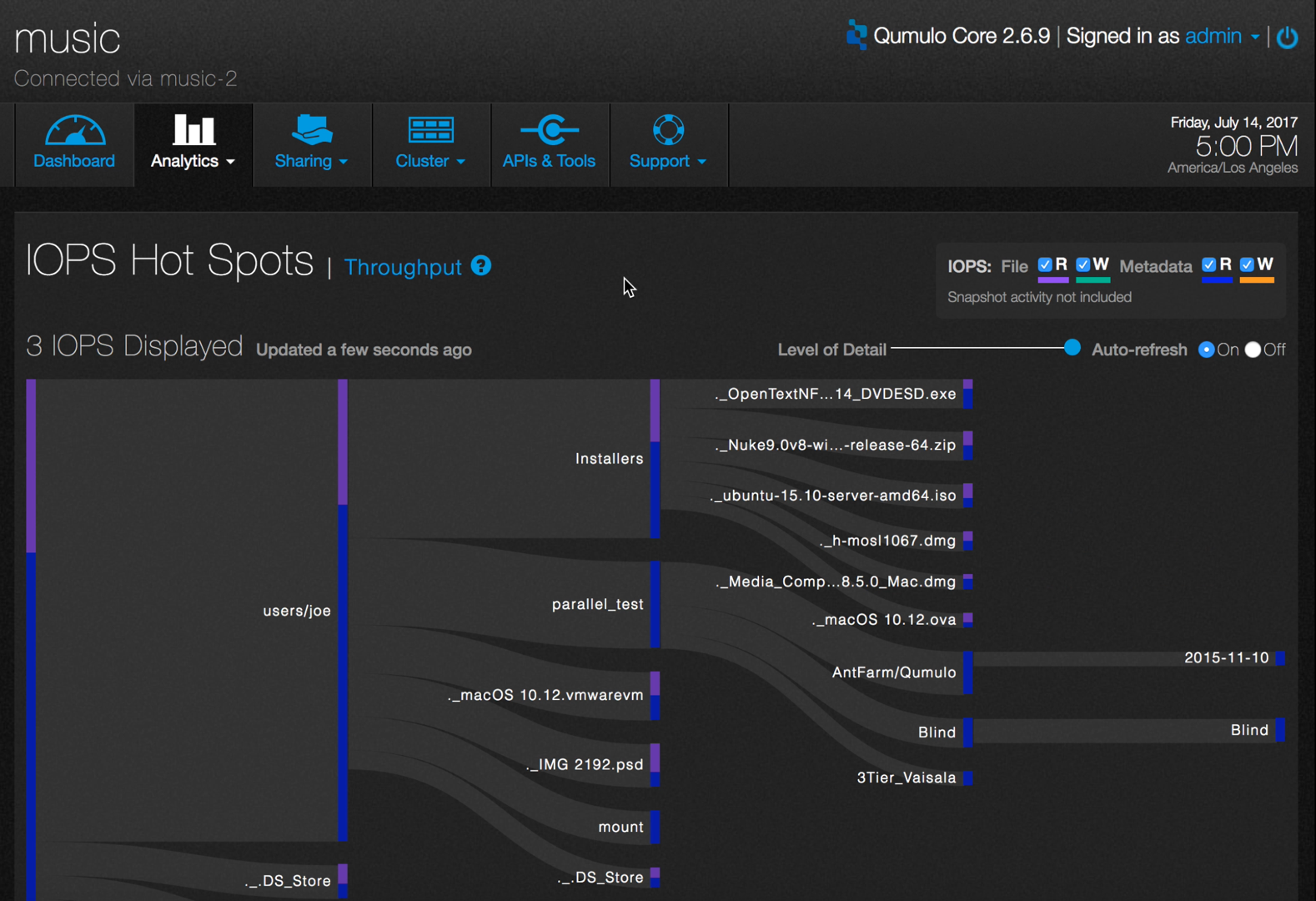
IOPS stands for Input/Output Operations Per Second and it is used to inform system activity. High IOPS can cause latency and impair performances. Unfortunately for users, the data needed in real-time to troubleshoot and pinpoint the cause of performance disruptions was not available via their existing storage solutions.
The Sankey visualization removed the guesswork so that users can immediately see paths to high activities without having to reacquaint themselves with what the data is trying to say. It allowed them to shift their valuable time to other important tasks.
Cause and Effect
One of the biggest complaints we heard from users was that they could not identify the cause of a sudden change in their storage free space. The graph below shows how we solved this problem. In this example, there was a sudden increase of .93 TB between 1pm and 2pm, causing a sudden and unexpected change in the aggregated data. Note how the graph pinpoints the change on a timeline. Clicking on that change will show the details behind the change so the user can correct the issue immediately.

With Qumulo Data Storytelling
We gave users what they needed and empowered them to improve the services they provided to their end users. Switching to Qumulo’s products would drastically reduce the cost of customer support and shift their time to more valuable tasks.

Customer Love
“That’s a whole new category of file system analytics & understanding of what end users are doing under the hood that we don’t currently have … it’s phenomenal!”
Pixar
“We like that you don’t just offer analytics as a ‘we’ve got them too’ bolt on feature; you’re actually building a business around them.”
LAIKA
“I think your company is doing something right here. These analytics being brought to the forefront is impressive because getting metadata has always deadlocked other file systems I’ve used and that doesn’t appear to be a problem for you.”
GE Research, Storage & HPC
